Our work speaks for itself.Take a look at a selection of my projects, crafted with care and designed to make an impact. Each one tells a story of creativity, collaboration, and results.
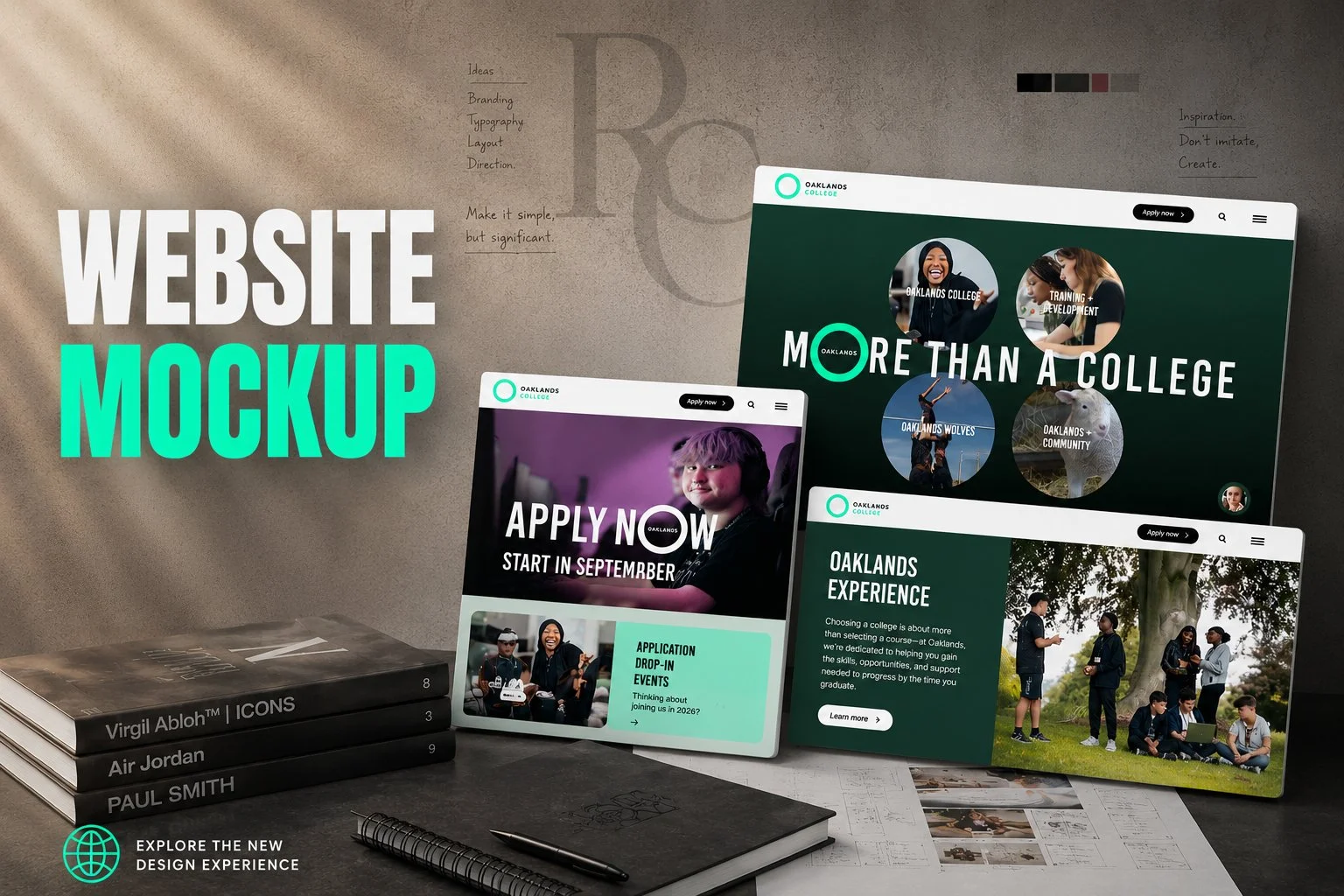
This website redesign was created as part of a wider evolution of the Oaklands College brand, shifting from the previous light blue palette to a richer green tone inspired by the college’s heritage and the St Albans landscape. The redesign focused on improving usability and accessibility through cleaner layouts, simplified navigation and stronger visual hierarchy, making it easier for students, parents and staff to quickly find information. The overall approach combined modern digital styling with a refined editorial aesthetic to create a more contemporary and distinctive online experience.
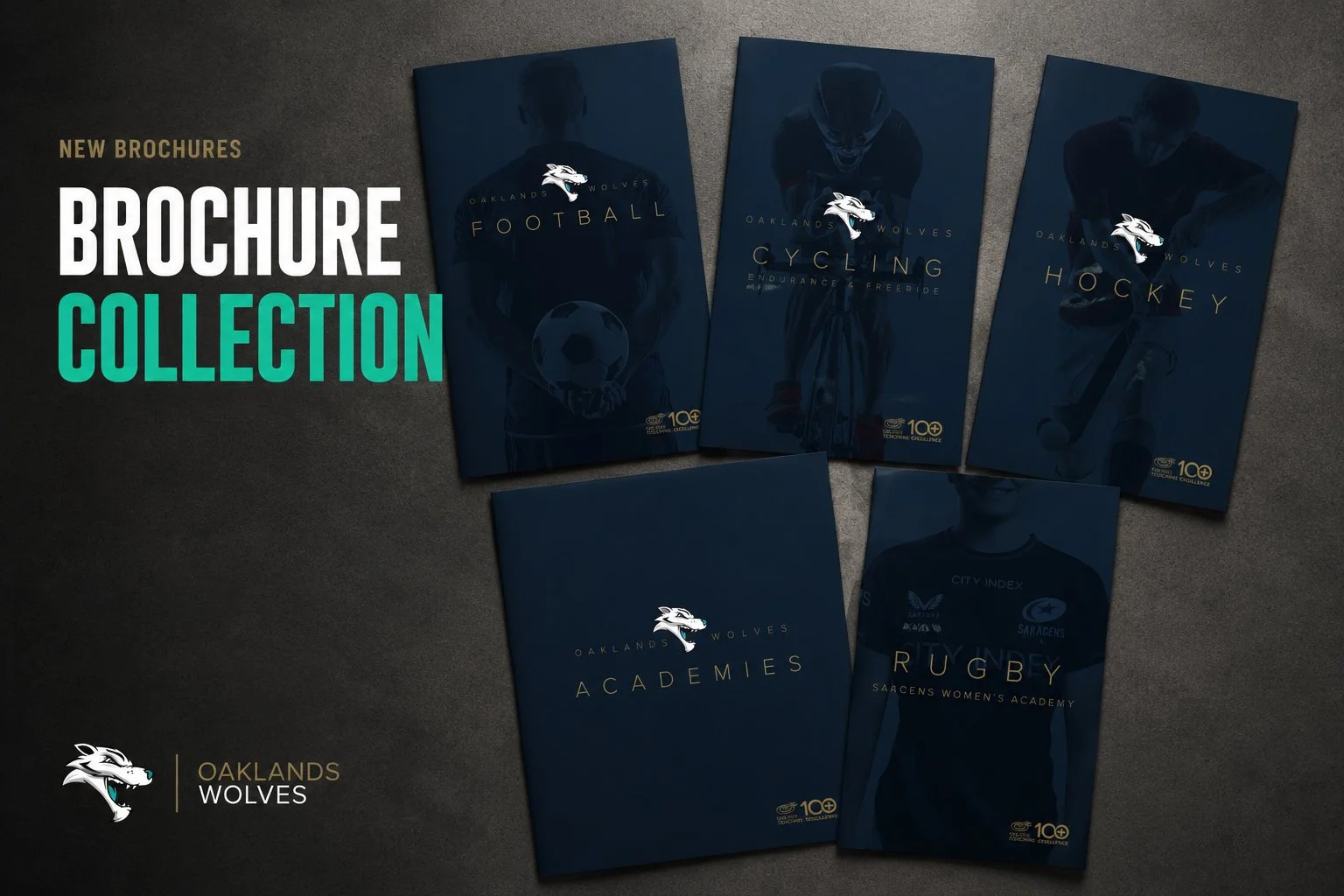
This brochure collection was created for the Oaklands Wolves Academies to introduce a more premium and professional visual identity across print and digital platforms. Moving away from the previous brighter style, the new direction focused on a darker, more cinematic aesthetic that felt ambitious, competitive and performance driven. Using refined typography, dramatic imagery and minimal colour palettes, the brochures were designed to position the academies alongside professional sporting brands while creating a stronger, more aspirational identity for each programme.
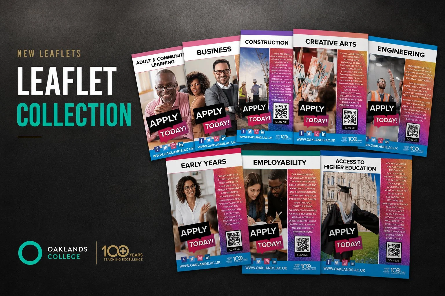
These leaflet designs were created as part of the previous Oaklands College brand identity to promote a wide range of courses and opportunities across the college. The project focused on creating a bold and engaging visual style that appealed to prospective students while maintaining consistency across all departments. Each leaflet used distinct colours, imagery and layouts to help course areas stand out, while strong typography and clear calls to action created eye catching and accessible promotional material across both print and digital formats.
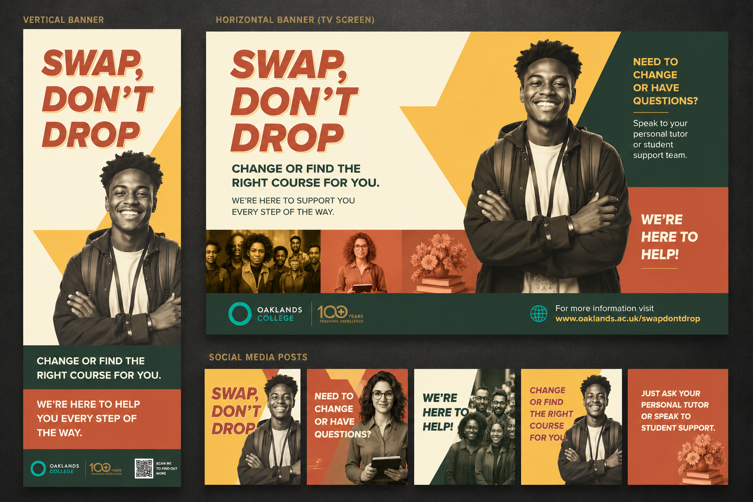
The “Swap, Don’t Drop” campaign was created to encourage students who were unsure about their course choice to explore alternative pathways rather than leave education altogether. Designed to feel supportive, approachable and energetic, the campaign used bold layouts, strong typography and a modern colour palette to stand out across print and digital platforms. The project also reflected Oaklands College’s evolving visual identity, combining playful creativity with a cleaner and more contemporary design approach.